![הדר [12/02/2014 10:28:33]](/branding.irit-hayon.com/originals/header(7).jpg)
.png)

.png)
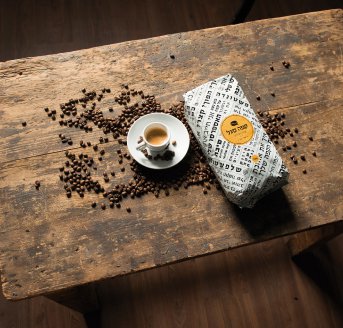
• Packaging Design •
Our world is overflowing.
Everywhere we turn, we are flooded with messages, products, new things we simply have to try, new versions we have to buy, new trends we must keep up with.
Our global village is becoming more and more accessible, and the branding we are responsible for needs to be much smarter and more accurate, if we want it to stand out from the crowd.
In a world where you can buy almost anything online and have it delivered to your doorstep from anywhere in the world – the middlemen get eliminated. With virtual stores that have pictures of products instead of display shelves, there are no salespeople to guide us to the right product, no signs and informative leaflets; we are left with only one thing: the product itself. And when the only way to communicate is through the product, we need the product to communicate well. This is where the power of packaging comes in. Packaging has long ceased to be a just means of enveloping or protecting the product. Packaging says everything. It defines the character of the product, and when it reaches the shelf, be it physical or virtual, it can decide its fate. Your brand’s packaging will determine whether it will succeed or fade from memory.
When the packaging is the only “middleman” left, the weight on its shoulders becomes heavy indeed. Every detail matters: shape, size, material, color. What is the correct combination for making the product stand out in a sea of competitors? Which “cover” will make the consumer open the “book” and look inside?
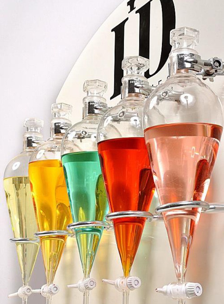
• ID PERFUMES •
The ID-Perfumes brand is all about individuality. It allows each customer to create his or her own, unique perfume; a private scent, with no other like it. Using a special matching method developed by Idit Kugel, each customer, male or female, fills out a short personality test, with questions that have nothing whatsoever to do with perfumes. The answers are compiled into an accurate and unique personality profile, which the “nose” then uses as a guide, as he creates the customer’s own, individual scent.
The brand’s packaging reflects that uniqueness. Each bottle of perfume is sealed with a handmade tin seal, stamped with the brand’s logo. The bottles are then placed into discrete, white tubes that perfectly reflect the spirit of the brand: providing the customer with a personal, intimate and unique experience.
ID Perfume has bravely taken up an incredibly difficult task: to reeducate a market set in its ways, making it embrace a new perception about the world of perfumes. We have no doubt they will go far, for we have faith in the ability of their brand experience and packaging to take them there.
.jpg)
// The minimalistic logo of the brand, cleverly containing the field it belongs to //
// A unique perfume bar //
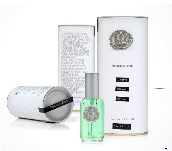
// Your personality traits, identified using the questionnaire (romantic, creative, sensual, optimistic etc.), impressed into the perfume’s packaging after its creation //
.jpg)
// The logo, stamped by hand into the silver tin seal, one bottle at a time //
• JUL •
Jul, a line of professional hair design and care products from Gid’on Cosmetics, is a brand that simply cannot be ignored. Having identified a need for supplementary care products, the company decided to make a bold move and create an innovative care brand for a closed, limited market.
This brand stands out thanks to its minimalistic visual vocabulary, its unique packaging, exclusively made in Italy; and, most of all, its original color. Created in a lab especially for Jul, this hue is the only one of its kind. It provides the brand with substantial memorability and visibility, taking it to the very top of its field.
.jpg)
• G.R.A.S •
In our long years of work with the G.R.A.S jewelry brand, we have tackled some interesting challenges. One of these challenges was designing a limited packaging series, where every four items fit together and created an image, like puzzle pieces. This creative solution meets a marketing need to increase the number of products bought in a single purchase and reinforce the “collectible” factor.
The illustrated packaging line targets teenage girls, allowing them to place a personal inscription on one side. All the illustrations are drawn by hand, by the studio’s designers.
.jpg)
// 4 illustrations that make up a whole picture //
.jpg)
// A custom inscription, as requested by the customer //
Alongside the (limited series) illustrated packaging, G.R.A.S continues to reinvent itself, and has recently launched a classical, adorned packaging line that meets the various needs of its customers, completing their shopping experience.
.jpg)
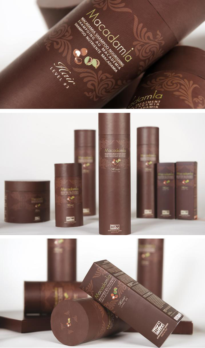
• MACADAMIA •
The story of Macadamia is one of international success. A small, Israeli brand that began with one man "Meir Dayan" and one innovative formula, Macadamia has since taken the world by storm.
When Macadamia came to us, we were a little concerned. While their vision was grandiose, the market they were facing was extremely difficult and competitive, controlled by giant corporations. We were challenged with communicating all the qualities of this wonderful product to the world, in a way that would leave no room for doubt.
The packaging of this macadamia oil based line of products successfully convey the product’s richness, while taking up an innovative position through an irregular choice of color. The dark, warm, almost chocolaty tones stand out in the world of cosmetics, which almost always sticks to white and its derivatives. This unusual choice has proven itself. Today, Macadamia is one of the best selling product lines in the world, distributed widely in the US, Europe and Australia.
Johnson & Johnson approached us with a marketing problem: they wished to enter the market with a new, expensive brand of contact lenses, imported from abroad. The challenge: the contacts came in two standard packs that looked exactly like the product’s cheaper predecessor.
The beautiful case we designed contains two packs of contact lenses, positioning them far above the existing alternatives. The design of the case incorporates a mirror lamination, silkscreen print and enhancements, all of which create a classy, distinguished look.
The packaging has won several impressive design awards around the world.
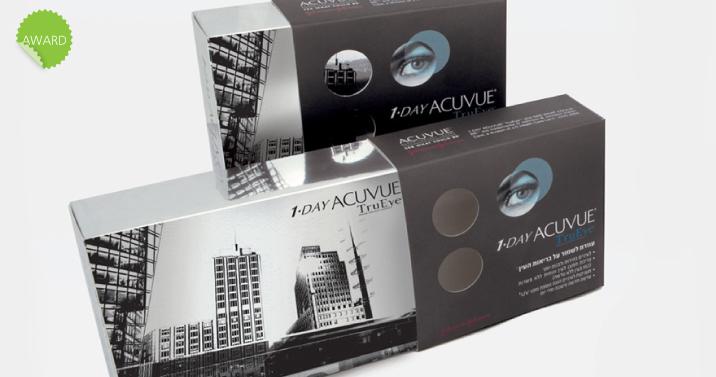
// An adorned case for two packs of contact lenses //
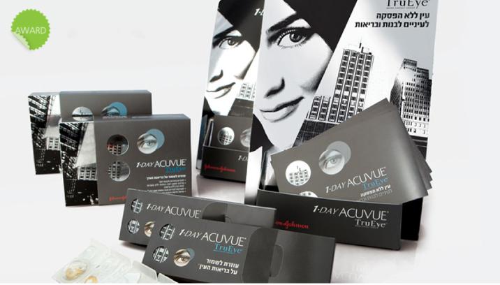
// An adorned case, a small test kit and a stand for the point of sale //
• TALI'S •
Located at the heart of Neve Tzedek, Tali’s is a charming boutique store with a large, varied product collection.
In order to provide Tali’s with a comprehensive packaging solution, we decided to “dress up” the receptacles. With prints, ribbons, gold coins and designed labels, the new “wardrobe” ties all the products together, making them speak the same language.
.jpg)
// Liquor and confiture bottle branding //
.jpg)
// Spice bottle branding //
.jpg)
// Limoncello bottle branding //
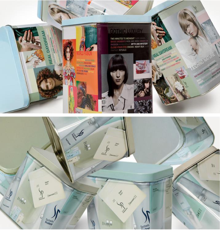
• WELLA •
Designed for Wella’s professional product line, these metal boxes are an original packaging solution. The sides of the boxes convey the forecast for that year’s hair design trends.
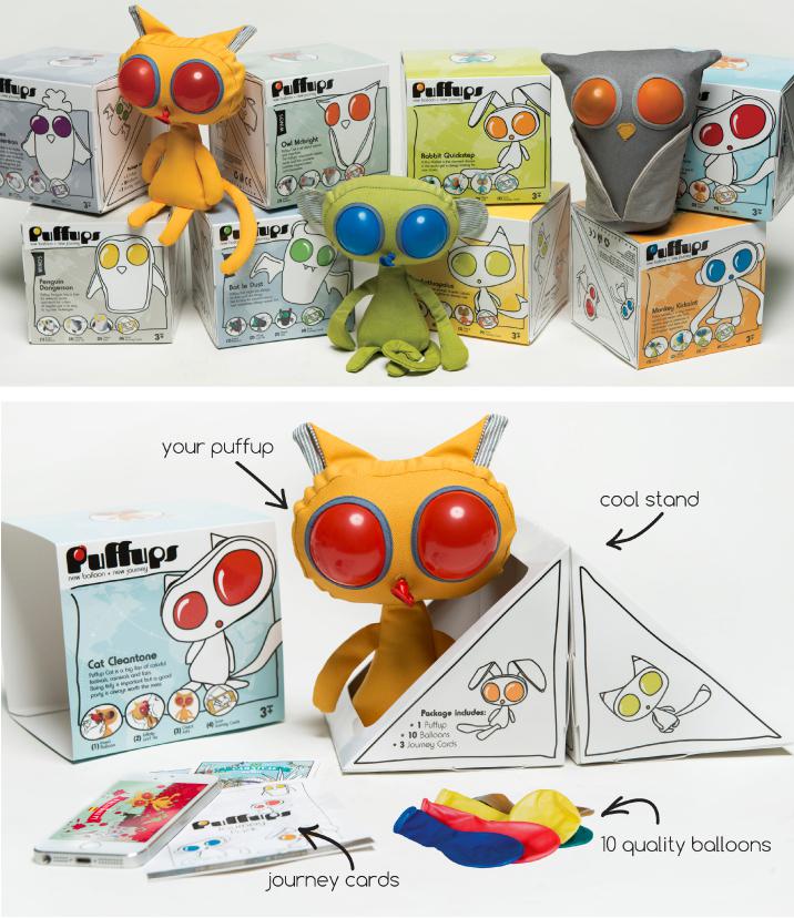
• PUFFUPS •
You’ve probably already heard quite a bit about Puffups. The packaging of this lovely product can meet more than a few demands: the boxes stand out on the toy shelf, they serve as a “house” for the dolls they contain and they transform into a play area, once opened. The result: smart, modular packaging that enfolds an entire world.
Read more
• A quick peek abroad •
Danish shoe brand, Gürtz, has launched a packaging line for shoelaces, where the shoes become colorful little worms, caught in the beaks of five different birds. Aside from being functional, this unique concept has made packaging into a game and a collectible item, increasing sales and catching the customers’ eyes.
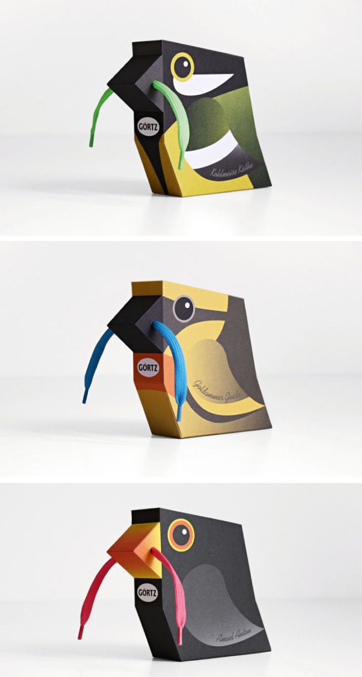
Head of Marketing: Michael Jacobs
Design: gürtlerbachmann GmbH, Hamburg
Creative Direction/Concept: Uli Gürtler
Art Direction: Merle Schröder
Project Management: Anne Kukereit
Illustration: Merle Schröder

There is no denying it – we like our “covers”. We love beautiful, special, inspiring covers. Often, we grant these “covers” so much importance, that we forget that beautiful though they may be, that which lies inside them is much, much more important.
So, until our next newsletter, we wish you happy days,
fascinating processes and an exceptional new year!
Like our newsletter? We’d love to hear from you
like // share // tweet or even call us
at +972-3-6090802
.jpg)